As Clear As Mud
To see what is in front of one's nose needs a constant struggle. -
George Orwell
It's not what you look at that matters, it's what you see. -
Henry David Thoreau
FONT SIZE
Does Size Matter?
Like many things in life, the answer is probably,
YES
but again like life it is usually not the most important factor for "Visually Impaired" people trying to read directions/instructions on labels.
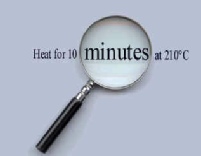
A good pair of reading glasses or hand held lens will often help here.
However this does not help in all situation
The Problems
FONT COLOUR
This can be a shady area
Our eyes are more sensitive to some colours than others.
Ever thought why "Emergency Exit" signs are in
GREEN not RED.
Well our eyes are more sensitive to green than to
RED.
Simple,
but not so if you are designing food packaging.
Is any thought given to colour blindness?
Many people cannot distinguish between RED and GREEN
or between
GREEN and BLUE
On their own these colours are not a problem but imagine a RED background with GREEN text, BLUE background with GREEN text.
IT HAPPENS
and we can not read it.
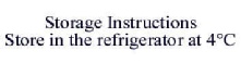
CONTRAST
Viva La Difference
This is perhaps the most important criteria.
Many people with sight problems can see small print, even very small print if there is good contrast between the background and foreground.
Hover Over for more examples
O.K. SO
BLACK and WHITE
IS
BORING
But we can see it.
CLEARLY
A Good Idea
So you do not believe it then go to Examples


| Hall Of Shame |
| The Good Guys |
| Non Food |
| Useful Addresses |
| Links |
| Useful Gadgets |