The Good Guys
Or
How it should be done
Some Examples of good labelling
At Clearlabelling we are always ready to criticize, and to point out examples of bad labelling. So on this page we are going to praise the few companies who produce products with good clear labels.
In other words:
LABELS THAT WE CAN READ
The rest of you take note and perhaps even learn from their examples.
Below we have several labels that have used different approaches to producing good looking packaging, While at the same time making the label very readable.
So if you see examples of
"GOOD LABELLING"
let us know
We will be contacting the companies mentioned to compliment them. Perhaps it will encourage others.
WE CAN ONLY HOPE
CLEARLY
A
Good Idea
M & S Naan Bead
This was a very clear label,
Due to the type of material it is printed on
it did not scan too well. So does not look as good as it was.
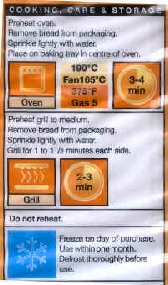
Quite good contrast, good use of colour, reasonable large. See "Black on White" does not have to be boring.
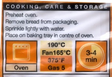
Budgens Naan Bread
Clear, good combination of contrast and colours,
good use of space on packaging. Clearlabelling congratulates Budgens
for this exhalent label.
Together with the front packet design it is quite an attractive looking product.
So we do not have to sacrifice READABILITY for STYLE
M & S Plum and Almond Pudding
Excellent use of colour and the packaging still looks good.
Hover over to enlarge
Tastes good too:).
________________________________
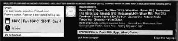
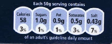
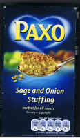
The alternative to the "Traffic Lights" Food Labelling
This one we can read
Thanks PAXO
| Hall Of Shame |
| The Good Guys |
| Non Food |
| Useful Addresses |
| Links |
| Useful Gadgets |